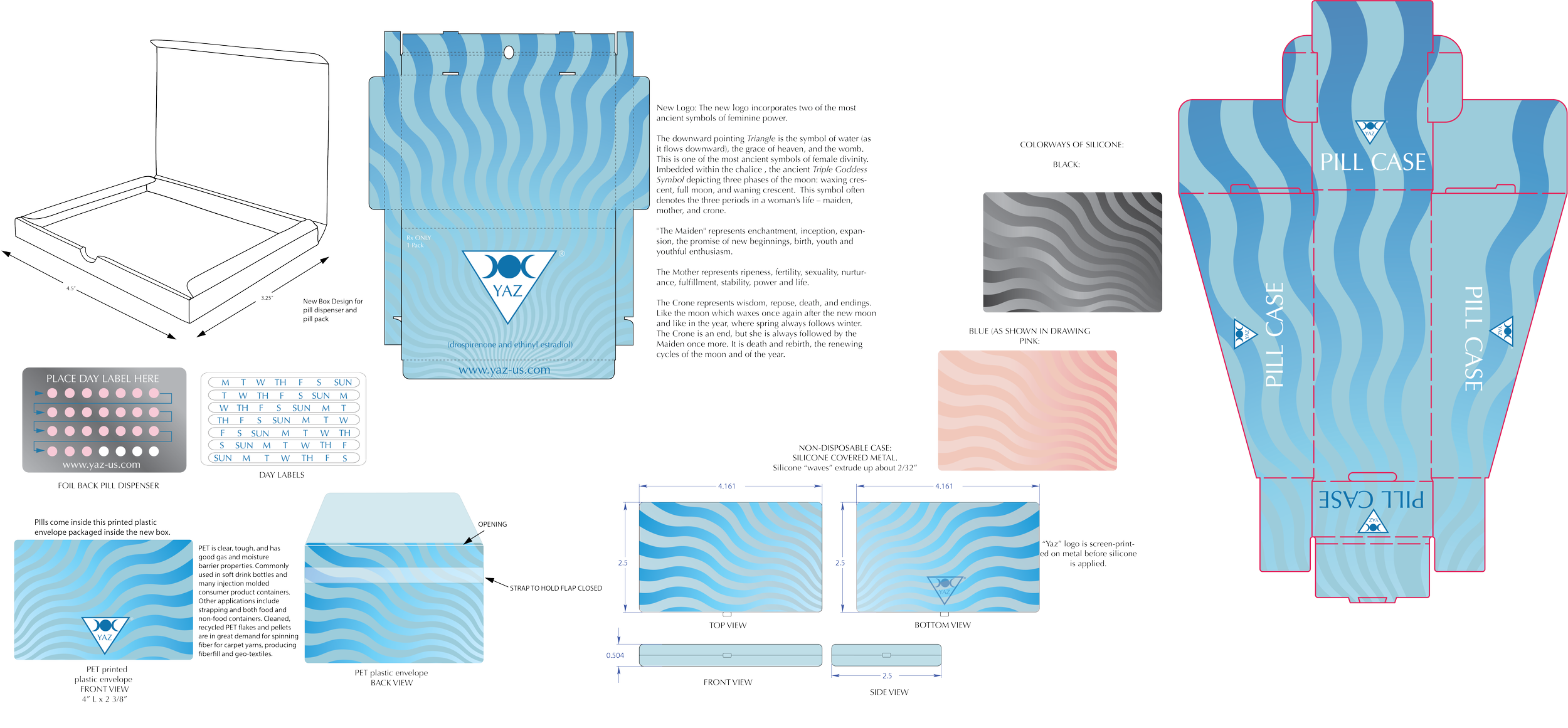
YAZ Birth Control Pill Case
Problem: Birth control pills are often packaged in ugly, disposable envelopes that fail both aesthetically and functionally. These designs are not only unattractive but also lack discretion, making a personal health product unnecessarily conspicuous and inconvenient to carry. This outdated approach to packaging highlights a missed opportunity to create thoughtful, user-centered designs that respect privacy and delight the customer.
Solution: I created a few different designs for this competition, but my favorite was a non-disposable mirror compact that functions as an attractive and safe holder for birth control pills. My design grew from a new identity I created for the brand.The new logo incorporates two ancient symbols of feminine power. The downward pointing Triangle is the symbol of water, and the womb. Imbedded within the chalice, the ancient Triple Goddess Symbol depicting three phases of the moon: waxing crescent, full moon, and waning crescent. This symbol denotes the three periods in a woman’s life – maiden, mother, and crone. Made from metal and molded silicone rubber.


